Collections

Draw me a banknote

By Stéfane Antoine, Museum guide

While banknotes are essentially a means of payment, they are also a kind of visiting card for the issuing country.

In short

Before being put into circulation, a banknote goes through a whole series of design stages. Many drafts did not succeed in the end and today make up one of the most important collections of our Museum. The artists, whether selected directly or having won a competition, had to take into account different criteria and their creative freedom was therefore curbed. It was necessary to respect the classic format for the banknote, the theme chosen by the National Bank, highlight the value of the banknote, as well as making space for security features. While originally, the wording took up most of the space, from 1869, the design became more and more important. The banknote is a business card for the issuing country and a reflection of the nation. For that, artists would use allegories and other depictions that highlighted Belgium’s ambitions and successes. In his Goddess of Wisdom Gleaning, the symbolic artist Xavier Mellery translated the message of the time into a design: a promising future awaits those of us who sow and reap what they sow.

Nowadays, it is the design that makes up the best part of our paper money. But what exactly is hidden behind the design of banknotes? On the basis of what criteria were artists or graphic designers selected and what did their work involve? After reading this article, you’ll find answers to all these questions…

Originally, it was the wording that took up more space than the design on the banknote. In Belgium, it was not until the banknote series produced in 1869 that a change was observed on this front. And it was also from this series onwards that banknotes featured an original reverse side, distinct from the illustrations on the front. That goes a long way towards explaining why it was decided at the time of this same series to split up the job of designing a banknote. From then on, the design and then the engraving of patterns would be carried out by two different people.

The 1869 series of banknotes was designed by the historical painter Henri Hendrickx, Director of the Saint-Josse-ten-Noode Academy. Even though there is no standard profile of the banknote designer, it is nevertheless worth noting that banks have often turned to painters, engaged as art teachers by various institutions. The drawing of banknotes was also entrusted to artists from whom various works had been commissioned for the governing authorities. Hendrickx, for instance, had also designed the floats for Ommegang and the triumphal arches for the city of Brussels.

Billet de 100 BEF
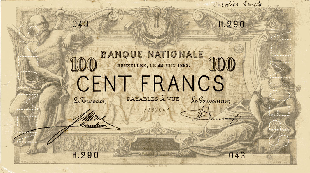
Obverse of the 1869 100 franc note © Museum of the National Bank of Belgium
Billet de 100 BEF
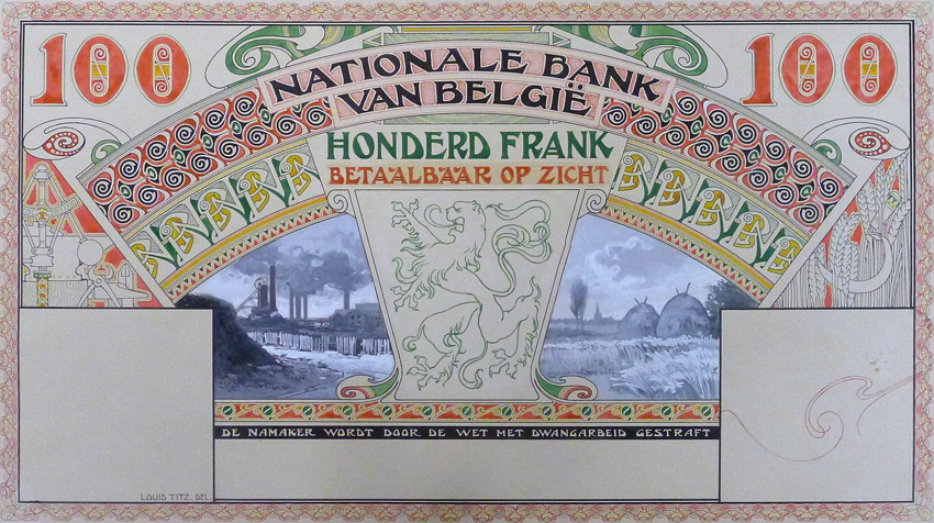
Louis Titz’s banknote design representing a Walloon industrial landscape and a Flemish pastoral landscape united by the Belgian lion © Museum of the National Bank of Belgium

The banknote constitutes a means of payment but is also a work of art in its own right. However, the artists had very limited scope to use their own imagination. It was in fact the National Bank that specified the theme to be developed for each new series and the banknote format also had to be respected. The design had to emphasise the value of the note and contain many details to enhance its security. Lastly, the banknote also had to be a reflection of the issuing country, a vector of the national identity, and hence the frequent use of allegories and messages referring to Belgium’s ambitions and success.

In practice, artists first of all came up with a preliminary draft which was then scrutinised by a special commission. A second proof, taking account of the comments that had been made at the first stage, was then mocked up. This version was further refined before it was considered to be final.

From a practical point of view, artists designed the model of the banknote on a much larger scale than the real-life note itself. The models were made on thick paper or cardboard, depending on the techniques used. The draft note was then sketched by pencil, painted using watercolour, oil-based paint, ink or even gouache. By contrast, the engraver worked to scale.

Designs and preliminary designs of banknotes make up one of the most important collections of our Museum. They not only bear witness to the development of art in Belgium but also to the themes chosen to represent the Belgian nation on the banknotes. Not all these projects ended up as genuine banknotes put into circulation by the National Bank. This was notably the case of Xavier Mellery’s plan, wisdom gleans on those of us who wait a few moments.

Xavier Mellery (1845-1921) was a Brussels-based artist, a major representative of symbolism in Belgium like Félicien Rops, Fernand Khnopff and Jean Delville. A great many symbolic compositions may be attributed to him, presenting allegoric and mythologic figures drawn with a sepia wash on a gold background. The design of the 100-franc note that he proposed to the National Bank fits into this framework. The Goddess of Wisdom Gleaning is a decorative allegory depicting in the forefront a human personification of Wisdom, who is kneeling down and gleaning ears of wheat. In the background, the base of an imposing monument, decorated with a bas-relief representing labour with the oxen. Wisdom is accompanied by Cupid, who is literally coming to help. On the stone, one can read the word ‘‘Espérance’’ (Hope). While this design may convey many different meanings, its general tenor is clearly consistent with the message that the National Bank wanted to convey through the new 100-franc note to the inhabitants of this hub of economic growth that Belgium was in the 19th century: reason, labour and frugality enable us to face a promising and hopeful future.

Femme a croupis avec un angelot derrière elle
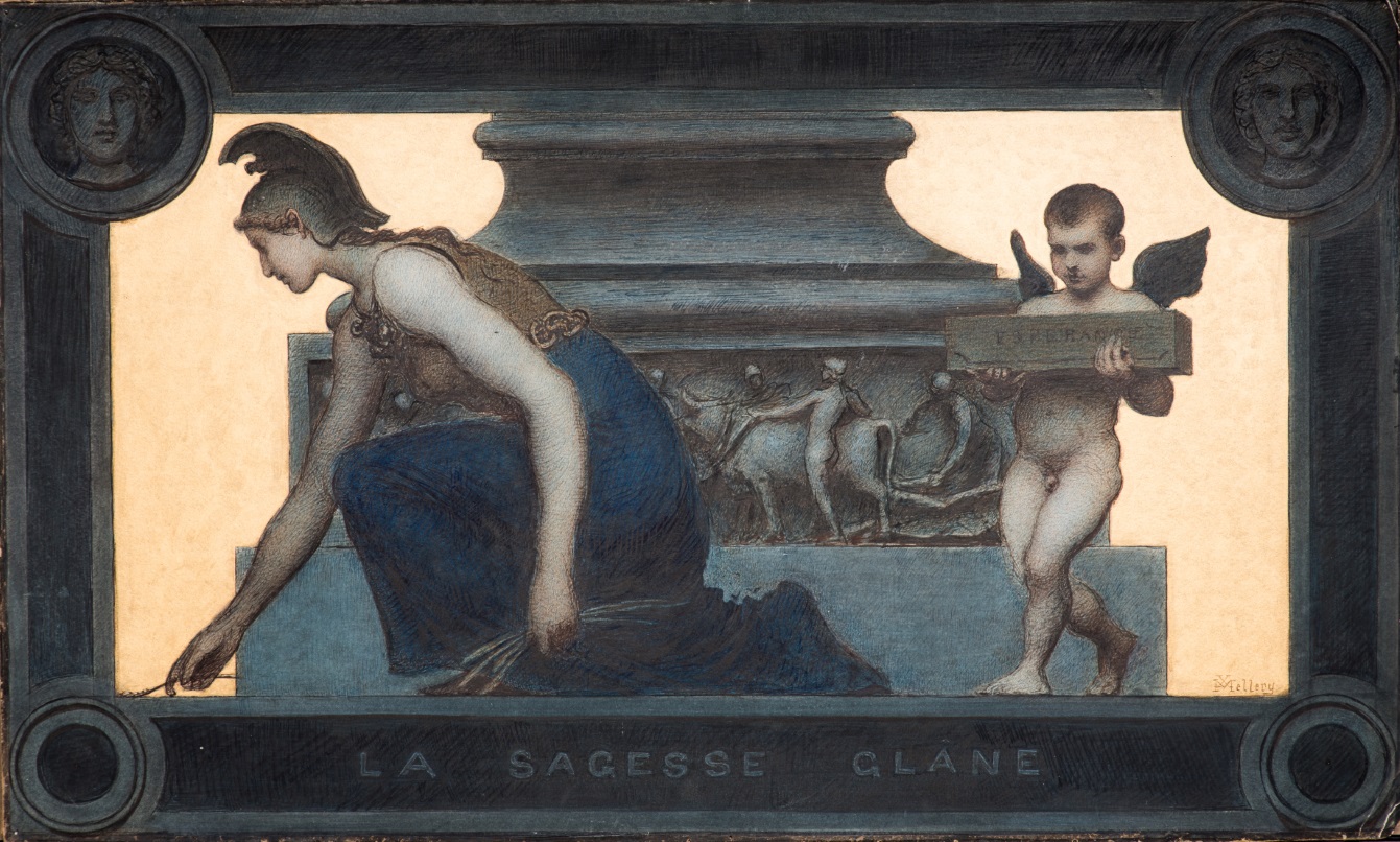
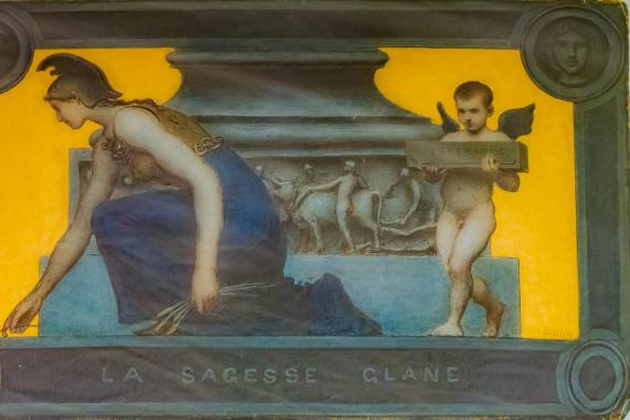
Xavier Mellery’s banknote design: The Goddess of Wisdom gleaning © Museum of the National Bank of Belgium
Billet de 20 BEF
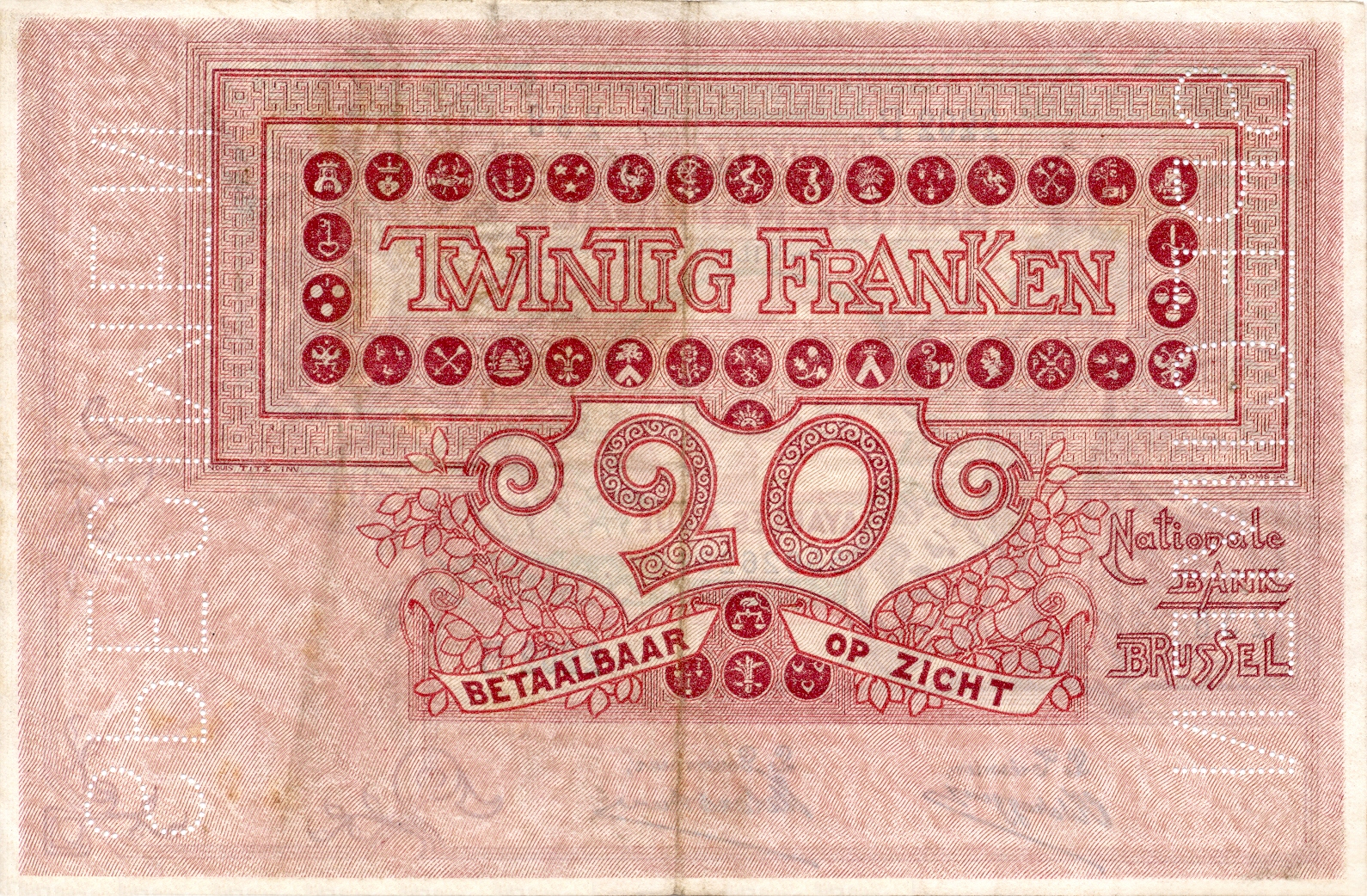
Reverse of the 1894 20 franc note © Museum of the National Bank of Belgium

From the end of the 19th century, the banks slowly started to set up contests, either open to anyone or, in some cases restricted to a few chosen artist and designers. For instance, in 1894, the National Bank of Belgium asked painters and illustrators Adolphe Crespin, Herman Richir and Louis Titz to come up with preliminary drafts. The contest was won by Titz. He followed a classic theme, but his interpretation was not lacking in imagination. The decorative motifs that run across the back of the note are proof enough.

In the absence of any selection contest, the choice of artist was one of the Governor’s prerogatives. This is what happened with Ghent-born painter Constant Montald who was chosen by Governor Victor Van Hoegaerden to design several banknote series from 1898 onwards. Although the archives do not reveal anything about the reasons behind the choice of artist, there are nevertheless a few coincidences. The Governor’s ties with the city of Ghent in fact dated right back to his early childhood. Also, having already won the Prix de Rome in 1886 and been appointed as an instructor at the Brussels Academy of Fine Arts in 1896, Montald got official recognition that did not go unnoticed by the Governor of the National Bank.

During the inter-war period, a new type of specialist in banknote design appeared on the scene, namely the graphic designer. This was someone with the distinctive ability to combine aesthetic sensitivity with the incorporation of communication functions and the technical constraints of the banknote.

Different features effectively have to be taken into consideration when a banknote is being designed. So, the banknote’s place in a series or the many different elements that have to be incorporated for legal or security reasons influence the end result. From the design point of view, it is therefore a question of striking a balance between the quest for finely detailed motifs, that are harder to forge, and deliberately simpler and clearer designs.

The sheer complexity of banknotes and the growing number of banknote-security-related constraints posed a major threat to the graphic designers’ creativeness. While in the case of banknotes put into circulation between 1978 and 1982, various external designers continued to be commissioned by the National Bank of Belgium, for the last series of Belgian franc notes, issued between 1994 and 1997, the Bank entrusted the production work to its own team of specialised graphic designers.

Billet de 50€ sous lumière UV
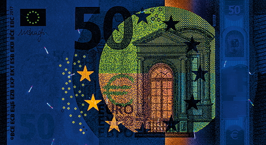
As a security feature, our banknotes react in a special way to UV light © European Central Bank
Billet de 20 euros
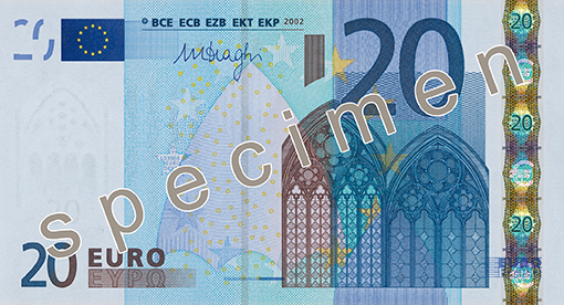
20 euro note from the first series © Museum of the National Bank of Belgium

As for the design for the first series of euro banknotes, it was chosen from the results of a competition held under two themes: ‘‘ages and architectural styles of Europe’’ and ‘‘abstract/modern design’’. The proposed designs had to create a sense of unity across the whole series of seven banknotes and also be attractive enough to the public to be accepted throughout the euro area. However, resistance to counterfeiting was still the main factor that had to be taken into consideration. The graphic designers had been selected by the central banks of the European Union (except for Denmark’s), with each central bank being able to name up to three graphic designers. As no rules had been laid down on this subject, some of them hand-painted or drew their model while others produced computer-generated designs. In the end, it was the Austrian Robert Kalina who won the competition, as his designs under the ‘‘ages and architectural styles of Europe’’ category were considered to be the most consistent and most representative of the Old Continent.

The principle of holding a competition was used for the second series of euro banknotes, called Europa. This time, it was a German designer called Reinhold Gerstetter who won the contest. He produced the banknote design on a computer using a software program. The National Bank of Belgium then had the job of transforming the design for the 5-euro note into a printable banknote. For that, it had to take account of the different security features as well as specific production stages and their limitations.

Bibliography

  • Brion R. & Moreau J.-L., Le billet dans tous ses États. Du premier papier-monnaie à l’euro, Anvers, 2001.
  • L’avènement de l’euro, notre monnaie. Un bref historique des billets et des pièces en euros, Banque centrale européenne, 2007.
  • Laclotte M. & Cuzin J.-P. (éd.), Le dictionnaire de la peinture, Paris, Larousse, 2003.
  • Le billet de banque belge, cd-rom, Musée de la Banque nationale de Belgique, 2001.
  • Ogonovszky-Steffens J., « Le billet de banque belge idéaliste – un petit format officiel, moyen de diffusion, à grande échelle, d’un idéal de vie et d’une imagerie d’État » dans Bulletin de la classe des Beaux-Arts, t. 10, 1999.